The Beginning
Well, It was a lazy start. I had been planning on redesigning the layout for few months before I actually started working on it in April 2021. I began with designing the layout using pure HTML, CSS. Intial layout ideas looked good, so, I started putting more effort on styling of it, while ignoring any addition of content. Meanwhile, Web-Components caught my eye. They looked interesting alternative to React.js. So, I planned on including them for the site. (Spoiler: I forgot about them)
Then, I discovered about Static Site Generators from JAMStack.org. It is quite a surprise as I was purely mistaken what they actually meant previously. After exploring bunch of popular static sites and their frontend architecture, it made me realise they are really something different than what I expected. So, I decided to finding myself a Static Site Generator to build my website.
Zola
As a fan of Rust Language already, I was finding reasons to learn and use it. From the list available in JAMstack, I found about a couple made with Rust. Zola is one of them, and it got my attention from reddit posts mentioning it. Few days later, I find myself playing with it. The process of intalling it in my Windows 10 machine also helped me to learn a couple of new things like setting Enviroment Variables and relation between binaries and CLI.
I Struggled a bit on understanding all the new stuff like Template Engines and its Content Generation using Markdown. So, I just skipped learning it and just ported a existing page I already did to use Zola. It worked somehow and I liked how fast it was for development server. Then I added TypeScript build step using Concurrently because I love TypeScript then. There are some bugs in the current build(v0.13) of Zola. So, I had to compile the Zola source code myself for the fix and well, that's my initial experience with Rust's long compile times.
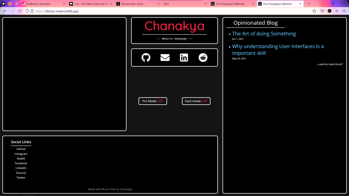
Suddenly, Designing became snail-pace for the rest of the month May. Maybe I was little stressed about some external stuff then or Didn't like the thought of having my own blog and website, Which I dont have a memory of now. But, It picked the pace again in intial june days after I figured out how to add Blog Section using Zola. By then, This is how it looks and I like it the view of it.... 
An Another Redesign
A realisation striked me that I don't have enough content to fill all blocks. I felt the need to replace some of the content space with emptiness, while also maintaining similar look. So, I started imagining new layouts and Started implementing one I felt would look good in a seperate git branch. This is where the project started picking up the pace again.
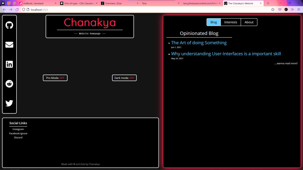
The 2 empty content blocks are merged into one and the Social Media links previously at the center where made to vertical list and moved to right side for the mobile versions for easy access. After a lot of polish in the next 3days, This is how it looks like... 
The tab navigation is implemented using TypeScript to navigate to other content. But, The emptiness in the center was still the question then. Ignoring it, I started concentrating on designing of Blog and Article page. Also Parallely, started implementing some devops stuff with Nodejs for automating build steps and while also, using latest dart-sass instead of zola built-in deprecated node-sass, automatic file clear on new builds. All this felt interesting! and a pleasant and proper intro to Node.
Then, It's high time for for URL parameters for sharing inner tab navigation state. I had to research some stuff and Web APIs. Thus, found the weird but cool History API and it's a good TIL moment. Quickly implemented this feature and polished it to perfection.
A Dissatisfactory Conclusion
Slowly, I implemented remaining planned features over next few days:
- Dark / Light Theme mode
- Showing my github events in the footer
- Add logo in the center empty space
- More polishing of Blog and Article pages
- bit of updates for Mobile Layout
While doing that, A thought that I wasn't learning anything new for then past few days and also, felt bit overwhelmed with no. of other planned stuff that's left to implement for a full-scale v2 release, it made me go bit insane. Then, I hated the website overall design, especially blog and articles pages. So, I postponed remaining features for v2.x releases and started polishing it for final v2 release. Actually, That's the best thing I did. Soon, I released it on "Jul 12th". Extra salt on this dissatisfaction wound is my academics (and vice versa).
I abandonded this article at 40%. Now, v2.2 is released, finally, more or less satisfied and Finished my first blog article.
Thanks for reading (I feel bad actually)